

Alumnus Builds Tool to Make COVID-19 Data Accessible

Wade Fagen-Ulmschneider
BS’05, MS’06
Teaching Associate Professor at
University of Illinois at Urbana-Champaign
Education: PhD, Computer Science, Illinois, 2013
MS, Computer Science, UT Dallas, 2006
BS, Software Engineering, UT Dallas, 2005
When Wade Fagen-Ulmschneider BS’05,MS’06 sees graphs, charts and data plots of the new coronavirus pandemic spread, he sees questions beyond the lines and dots.
“There is a story there – questions, answers, themes – waiting to be told with the right data visualization tools,” said Fagen-Ulmschneider, now a teaching associate professor at the University of Illinois at Urbana-Champaign.
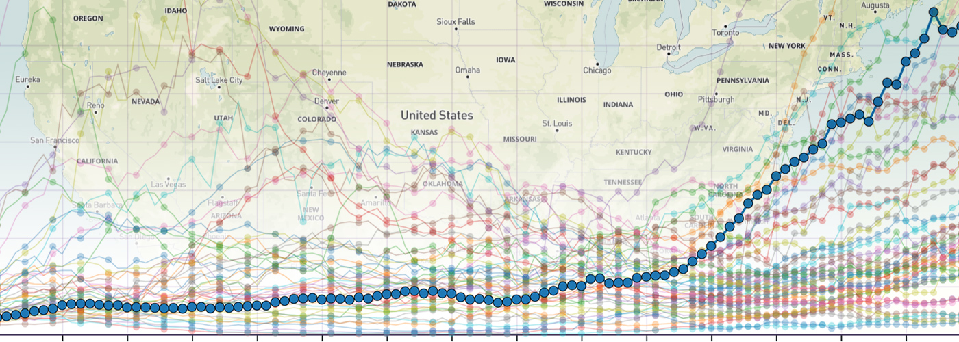
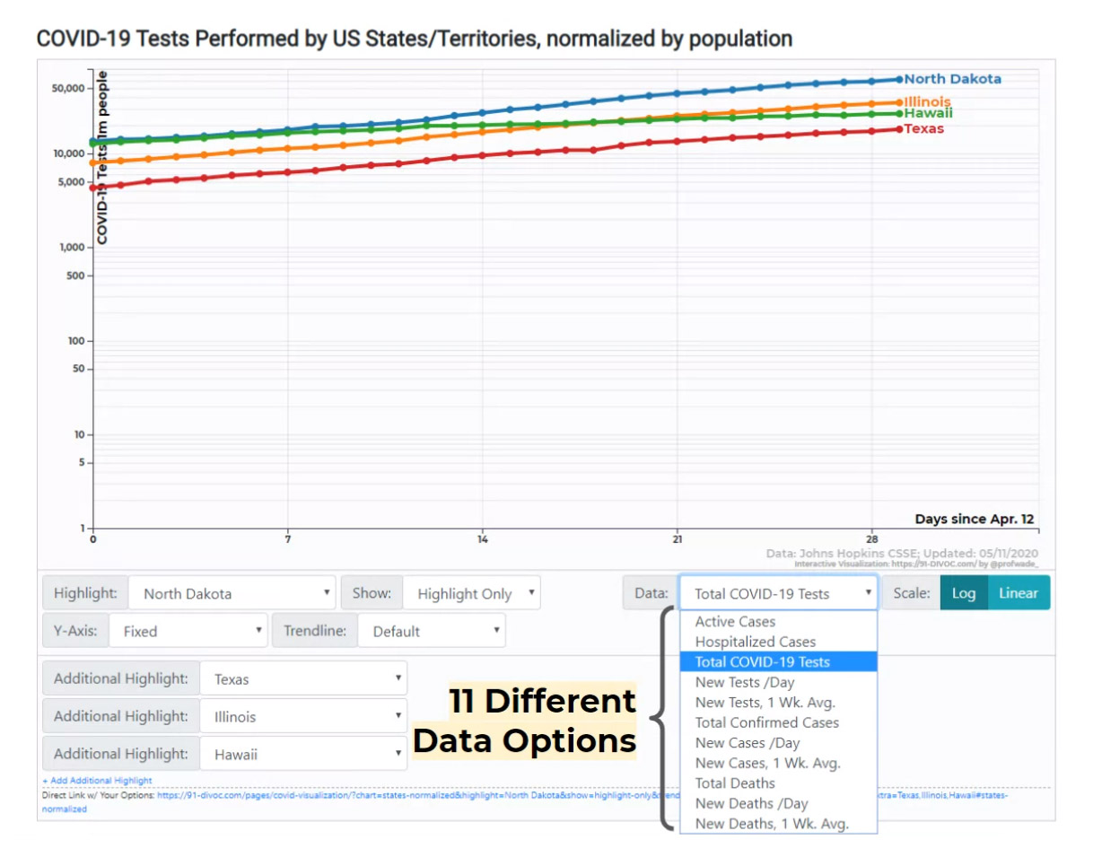
Fagen-Ulmschneider created a tool that allows users to find answers in the data and uncover stories of COVID-19 spread and its impact. His 91-DIVOC interactive visualization (COVID-19 read backwards, inspired by the UT Dallas COMET mascot named TEMOC) of COVID-19 communicates information in such an impactful way, that it’s been used by state officials and named by popular media outlets as a best COVID-19 visualization. His visualization has been used by governors of multiple states, featured across national news, and is updated every day.
“Even though we all wish that coronavirus had never happened, I feel visualizations about the pandemic are important,” he said. “As an educator, I appreciate that my tool can help people nerd out and tell the stories of COVID-19 in an accessible way.”
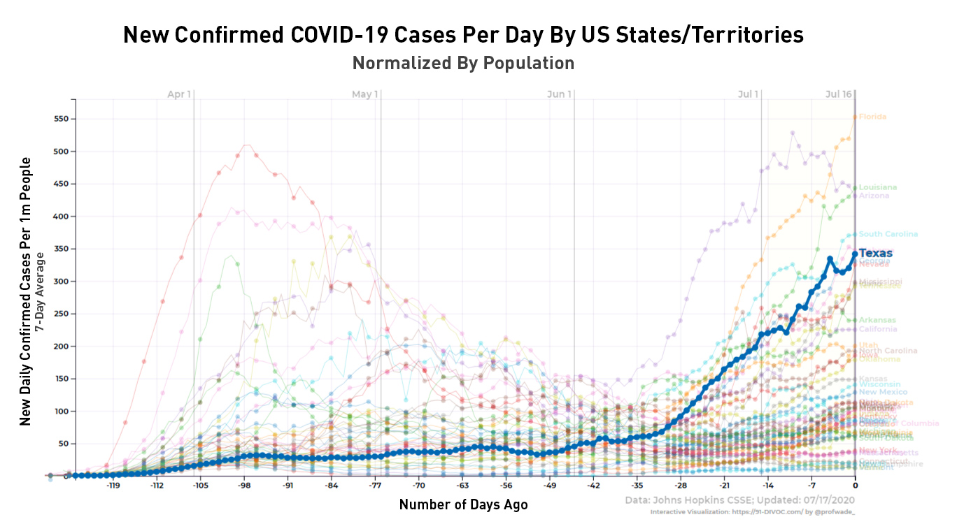
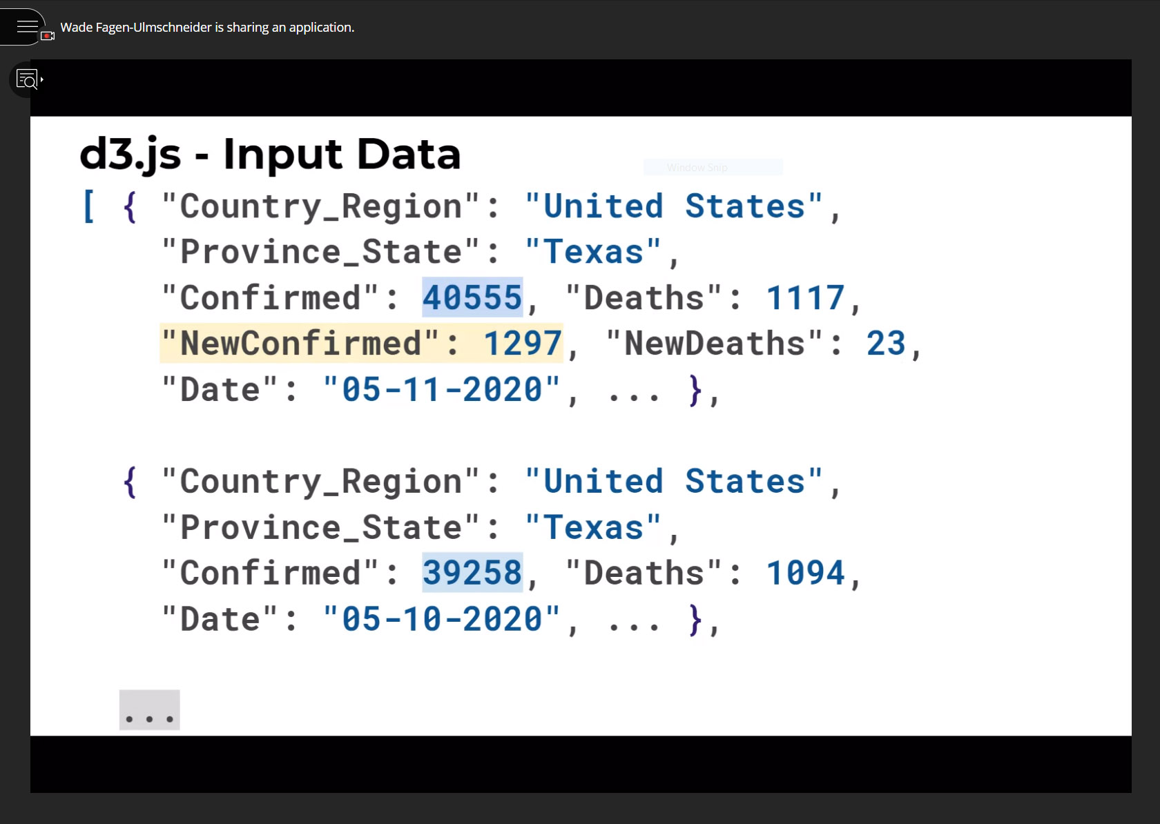
To create 91-DIVOC, Fagen-Ulmschneider started with the COVID-19 data collected by Johns Hopkins University and applied software to find answers to questions he had. The Hopkins data, arguably the most respected and trustworthy in the country, is high quality, reliable, open-access and updated daily, Fagen-Ulmschneider said. Using this data, he built his own visualization as part of a broader project to share 91 ideas, datasets and designs.
“This experimental idea is to build a community around making the best of the global pandemic,” he said. “People have expressed an appreciation for 91-DIVOC as a tool that provides a deeper understanding of what is going on with just the data – no modeling, prediction or expectation of the underlying data.”
In May, Fagen-Ulmschneider gave a virtual seminar to the Jonsson School and Illinois community about data visualization, focusing on features that make it compelling and the mechanisms of different software used to create the tool. His seminar was followed by a panel discussion, moderated by Dr. Murat Kantarcioglu, a Jonsson School professor of computer science, about COVID-19 data modeling and simulation efforts conducted by Kantarcioglu and other computer science faculty members.
“Effective visualization of the COVID-19 data to make it more understandable and accessible to both the general public and decision makers is paramount,” Kantarcioglu said. “Wade is one of our great alumni who contributed significant tools to make the COVID-19 data more accessible for the general public.”
In his seminar, Fagen-Ulmschneider encouraged people to experiment with software on their own to build “anything you can dream”. He also encouraged audience members to focus on mobile responsiveness – an attribute he says contributes to the positive reception of his tool.
“I still identify as a Comet today,” he said. “If you read COVID-19 backwards, you get 91-DIVOC. That name was available in mid-March when the pandemic was just beginning in the United States, and my time studying at UT Dallas inspired the name.”
91-DIVOC Has Been Used in Press Briefings or Highlighted as a best COVID visuals by:
MSN/Lifehacker
Popular Mechanics
State of Kentucky
State of Washington
The Verge
Posts


You May Also Like


